Upcoming User Experience (UX) Improvements for a Thriving Website - Summer 2024
مُثبت مُميَّزANNOUNCEMENT
Before we work on the below, we would like to share that we will not be working on it until we've completed our tech architecture revamp from individual country repos to a "Monorepo" that caters to the global team and speeds up development deployments.
You can watch the recording here between ~9:42 to ~13:05.
What is "Monorepo" and What does this mean to us?
- Currently, we have 20+ instances (country sites we maintain and manage), whenever we have to make an update or change it takes us a lot of time and effort as we need to make the change one by one manually for each instance.
- "Monorepo" is one global repo that hosts all instances. With one repo, we will be able to make updates and changes in one go than individually. One repo to rule them all!
- Enhanced country instance architecture means faster development, testing and deployment to the live environment.
Introduction
Welcome to the beginning of an exciting journey towards enhancing and optimizing our user experience (UX) on all country websites. In today's digital landscape, where user engagement and satisfaction are paramount, embarking on a website improvement project marks a proactive step towards ensuring your online platform meets the evolving needs and expectations of your audience.
Data-Driven, User and Moderator-centric mindset
We've uncovered opportunities for improvement and implement solutions aimed at enhancing usability, accessibility, edit ability, flexibility, and overall satisfaction.
Data-Driven Approach: Analyse findings from surveys, interviews, and user testing from moderators to understand user needs, pain points, and preferences. Test different design variations and measure their impact on user behaviour to identify the most effective solutions.
User-Centric Focus: Prioritise the user's goals and mental models when designing the website. Ensure the website is usable by everyone, regardless of their abilities.
Moderator Expertise: Present data in clear and concise visuals for easier interpretation and communication to develop roadmap. Continuously review, test, refine and improve the website based on data, experience, and user feedback.
Let's dive in and explore the transformative potential of UX website improvement, where every click, scroll, and interaction serves as an opportunity to delight and engage our users in meaningful ways.
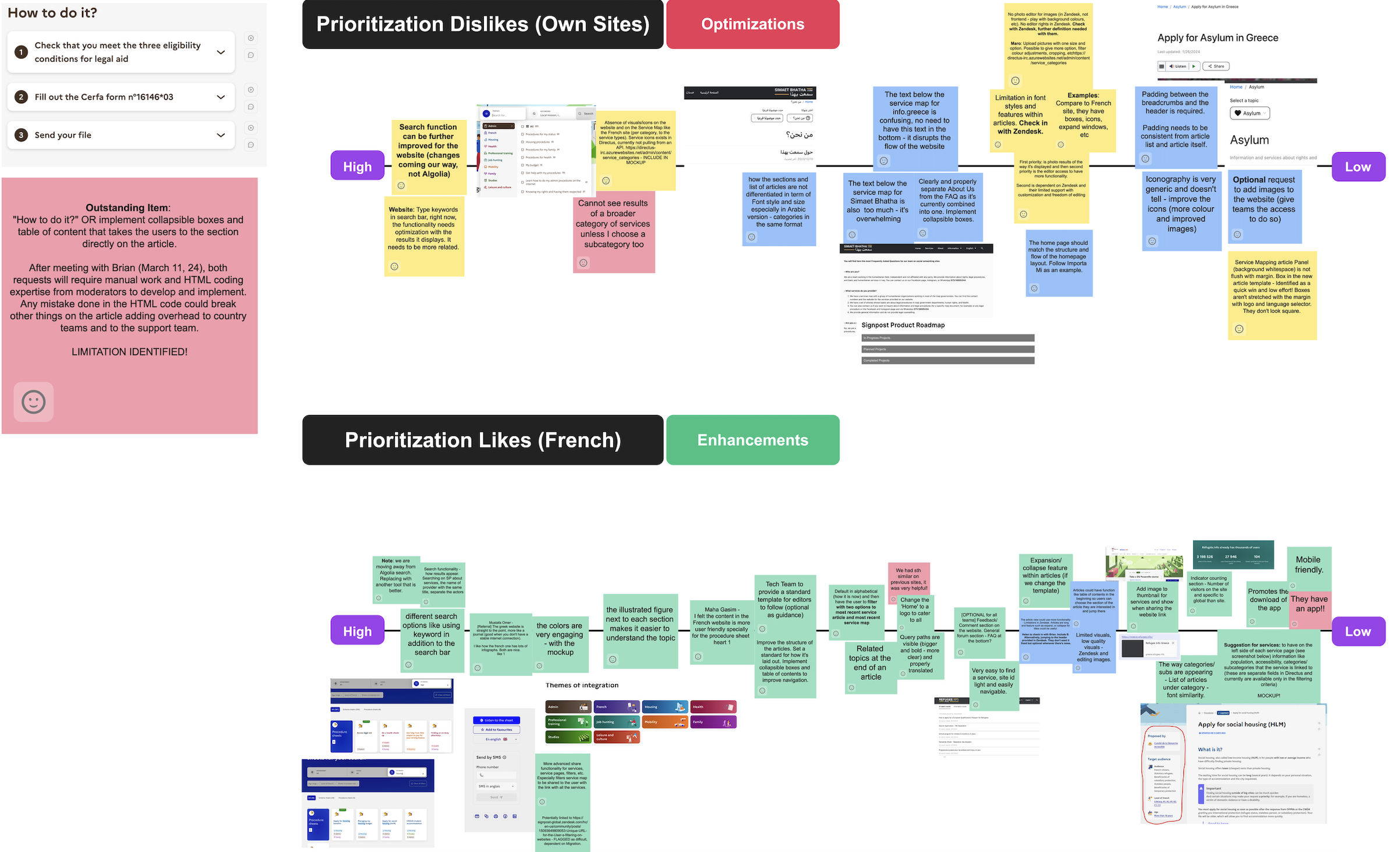
Prioritised UX Roadmap (March 2024)
Below, we've laid the groundwork for structuring, identifying and prioritising a successful UX website improvement project. This project is poised to align your website more closely with the preferences and behaviours of our target audience.
This roadmap was developed after meeting with a small focused group that has expressed interest in improving the website. A small group (2-3 members max from each interested country site) has allowed us to thoroughly discuss, engage, negotiate our needs productively, and most importantly, on track to target a completion date.
If you would like to deep dive into the roadmap and get a better view, you can access the link here.
For reference, the enhancement conversation were driven by comparing our Signpost website against the French Government website (here).

In a Nutshell
We'll focus on the high priorities for both Optimization and Enhancement.
For clarity regarding expectations, optimization requests will be addressed as our highest priority, focusing on improving existing functionalities that are currently not performing optimally within their environment. Subsequently, we will proceed with the implementation of new changes, features, and structures (enhancement).
Optimizations
- Search function to be further improved for the website. Changes are coming! It would be nice to type keywords in the search bar and have the functionality display all related results linked to the keyword.
- Sections and list of articles to be differentiated in terms of font style and size - especially Arabic version.
- Text below Service Maps to be updated as it can be confusing (example for RI Greece and Simaet Bhatha) and disrupts the flow of the website. Separate About Us from the FAQ as it's currently combined into one.
Enhancements
- Same as Optimization. Search functionality to be improved and how results are displayed.
- Option to add infographs (it will depend on the country team to determine if they want this as it can affect load time and slow down stable internet connections).
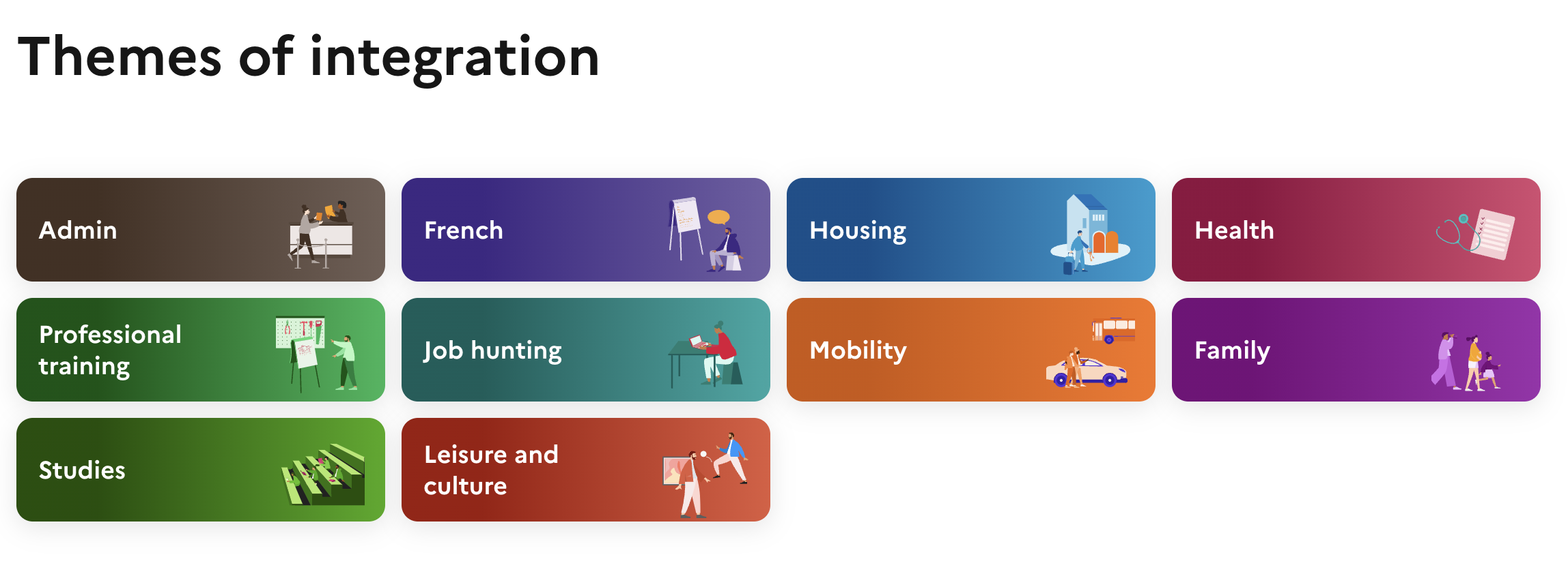
- Implement more engaging colours and illustrated figure next to each section makes it easier to understand the topic. Image shown below.

الرجاء تسجيل الدخول لترك تعليق.
تعليقات
لا توجد تعليقات