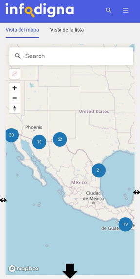
Service map accessibility
Suivi par 2 personnes
Hi everyone!
A few days ago, at InfoDigna we were reviewing the functionality and accessibility of the service map. We'd like to open this conversation to share some points that we consider may be important in order to improve the user experience:
- The size of the map (on the website for mobile devices) may interfere with the navigation on the website, mainly when scrolling: the space available to continue scrolling is very small. This can cause issues for some people

- When using the filters to search for specific services in the map, the system does the filtering automatically when selecting the options we want to consult. What about adding a Search button? So users can first select the desired filters and then, click on the Search button and the map displays the results. Also, it would be helpful to have a Clear All button in the filters
I'm not sure it these points have been previously addressed, or if they have been considered in the next update of the websites.
Thanks!
Feature Description:
Benefit:
We think that these tools can represent an improvement in website navigation and the search for specific information.
Use Case:
Brand-Specific or Global:
Global
1
Vous devez vous connecter pour laisser un commentaire.

Commentaires
0 commentaire